The interior colour edit: cobalt blue

TIPTOE x Klein Blue®
Joyful, vivid and radiant, cobalt blue is peppering interiors with a welcome dose of optimism. We look at beautiful objects in this vibrant shade, and at how to balance it flawlessly within the home.
You love a minimalist home but you love colour too? A simple environment calms you and grounds you, but you also need visual stimulation or it feels boring? Well, this sounds just like me. This is why I strive to introduce colour in timeless, balanced ways within my interior designs. I see minimalism as a lifestyle, not a style, and I don’t believe that buying less but better means you cannot buy colours at all.
And if you’re into blue, you may have noticed how it’s been quite prominent lately. I think it has to do with its positive significance, its evocation of the sea, of relaxed holidays in the sun. It’s the colour of the ocean and the sky, often perceived as symbolising serenity, stability, inspiration, and wisdom. Hindus associate it with Krishna, the god of love and joy, and Judaism with divinity and holiness, while in some Middle-Eastern cultures, it’s the colour of the evil eye bead, meant to protect from bad energies. With rather uncertain times upon us, it’s not exactly surprising to see this bold blue come back to the fore in interiors, the place where we want to feel most at peace, safe.
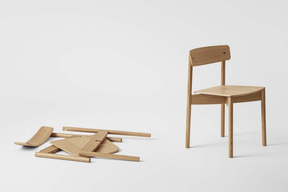
So welcome this colour into your home with my selection of the best cobalt blue homewares, like this new limited collection of furniture by TIPTOE and the Yves Klein Archives. A major artist of the 20th century, Yves Klein is known for creating an ultramarine blue of incomparable intensity, which he named "IKB" (International Klein Blue). It’s quite wonderful to be able to bring this unique colour out of art galleries and into our interiors for the first time.

Margaux Keller

TIPTOE x Klein Blue®

TIPTOE x Klein Blue®

TIPTOE x Klein Blue®
Shop the look

Pop chair, ₪1071, SIPA at Idana
Tove cushion, ₪560, Broste Copenhagen at Nortli
Eilo cushion, 75€, Broste Copenhagen at Smallable
The cookie jar, ₪638, Studio FE at Pasnormal
Verso vase, ₪475, ferm LIVING at Tollman’s Dot
Orasy candle, ₪188, Fest at Pasnormal
Deep Blue, from ₪260, The Poster Club at Bring It Home
Henny rug, from ₪445, Broste Copenhagen at Nortli
Feast collection high plate, ₪445, Ottolenghi for Serax, Edition by
Pitcher and set of 4 glasses, ₪195 and ₪195, Meira Sitton
Plant box, ₪1,145, ferm LIVING at Tollman’s Dot
Pantop portable lamp, ₪849, Verner Panton at Tollman’s Dot
Brooklyn coffee table, 549€, TIPTOE x Klein Blue®
Velvet knot stool, ₪1,400, Knots Studio
SSD chair, 299€, TIPTOE x KLEIN BLUE
Ada vase, ₪319, Broste Copenhagen at Nortli
Tray Table, a Designmuseum limited edition, 800€, BRDR.Kruger
Fernand coat stand, 492€, HARTÔ
Style it
If you’re wondering how to style this vibrant blue around your home, here are a few examples. Here again less really is more. Adding thoughtful pops of colour on a few key elements will be more impactful than spreading it to many places.

Broste Copenhagen at Nortli

HAY
Make a bold statement with playful colour blocking: add one piece of furniture in solid blue. An armchair, a coffee table, or even a sofa if you’re drawn to it. Keep the rest of the decor fairly neutral to avoid overwhelm and create strong, modern contrasts. You can also play with accessories, from simple throw pillows to full-on solid blue bedlinen. The good thing about this option is that you can change it around anytime you feel, so you don’t tire too fast of this daring hue.
Another great way to play around with such a vibrant colour is to conceal it inside cabinets and closets. Then when you pull them open, you get a bright pop of positivity, but it remains contained within, so it’s not a full-time feature of your decor. I particularly love these two versions by Mumbai-based design studio The Act of Quad and British duo 2LG. They’re fun but elevated.

The Act of Quad

2LG Studio

2LG Studio

HARTÔ
Geometric shapes also pair really well with a strong blue, from soft arches and circles to sharp angles and lines. And it’s a very clever way to highlight the architecture of a room too. For added contrast, don’t hesitate to play with finishes as well. Studio BURR, below, underlined door frames and passageways with blue lacquered surfaces that really stand out against the rest of the mat, neutral decor.
Overall, remember the 70:30:10 rule. 70% of your interior is a backdrop colour, usually neutral, 30% is a complementary tone, and 10% is your accent colour. That’s your blue.

Studio BURR

Studio BURR